ATT&CK Visualizer
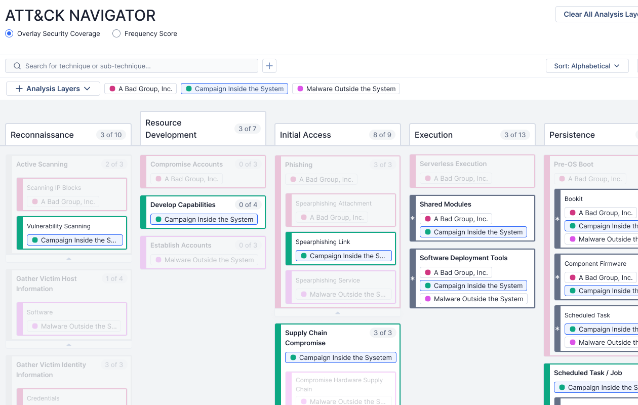
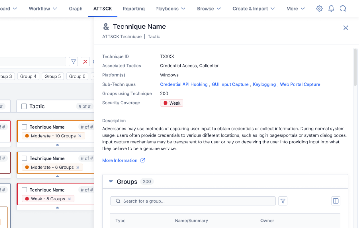
A reference screen that allows cybersecurity analysts to visualize threat actors' known tactics and predict the enemy's next moves
Cybersecurity analysts need to quickly review, record, and prioritize known patterns of malicious behavior to find insights and determine what has gone wrong, what may happen next, and where to spend time to best mitigate or prevent harm.
GALLERY
DETAILS
Requirements
- Navigate effectively through a large library of known malicious techniques
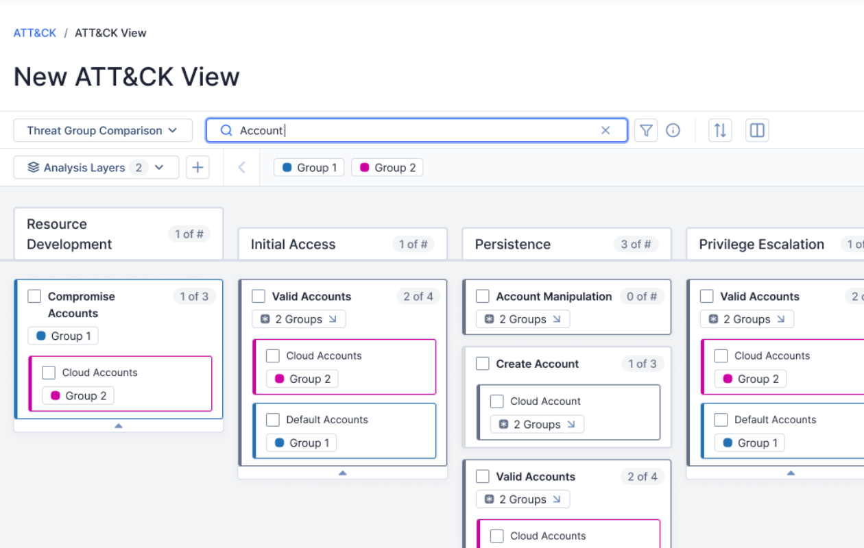
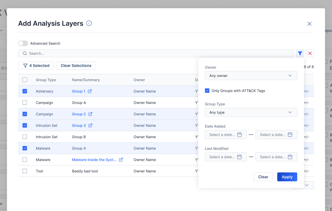
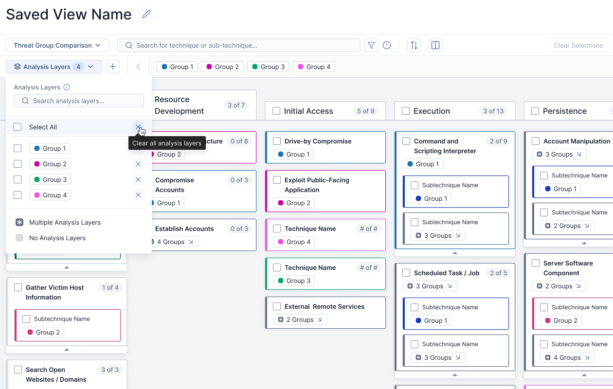
- Visualize attack patterns known to be used by specific threatening groups
- Compare tactics among groups to identify similarities, prevalence, and trends
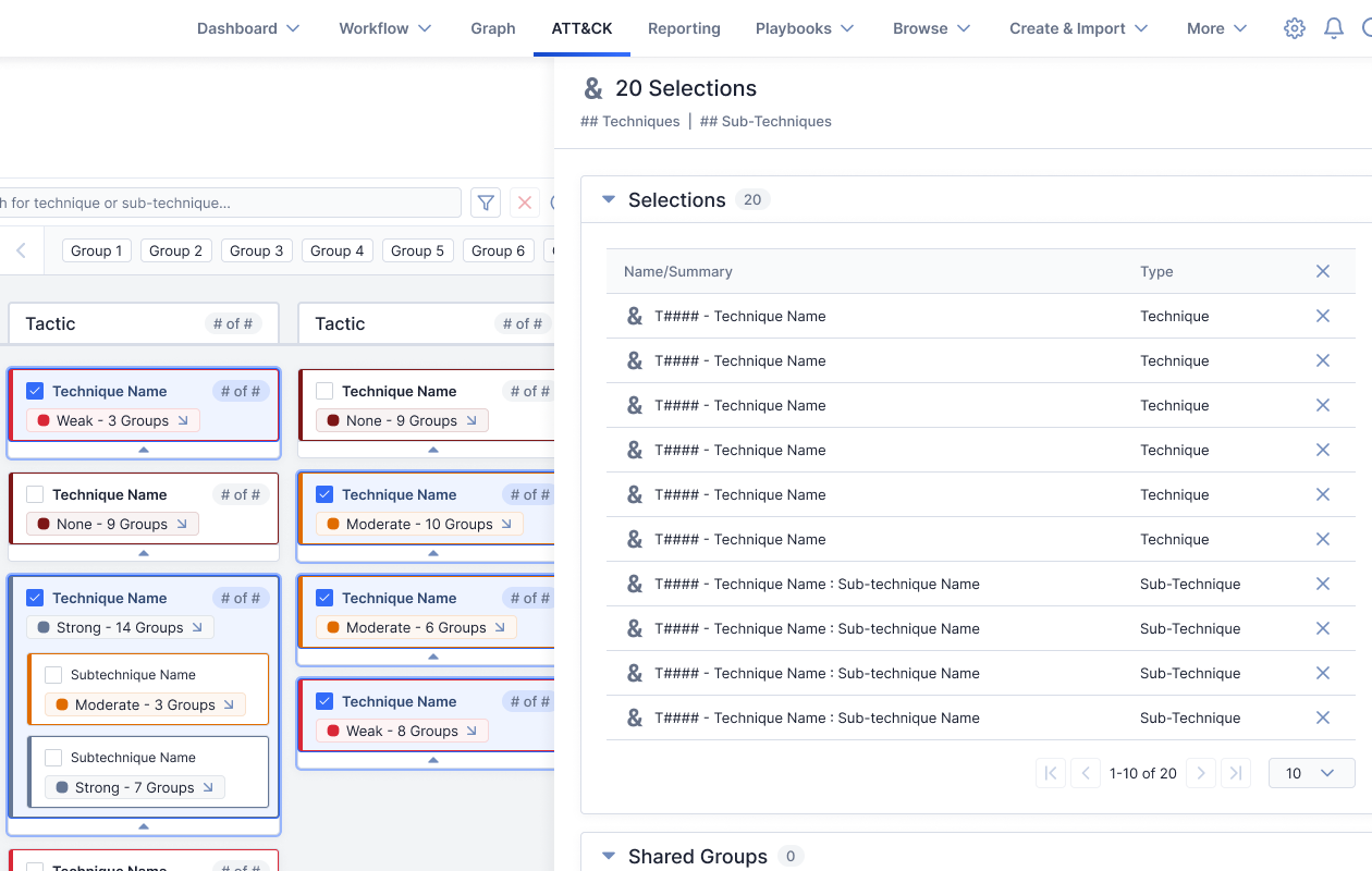
- Record & consider which techniques are of greatest risk to the organization
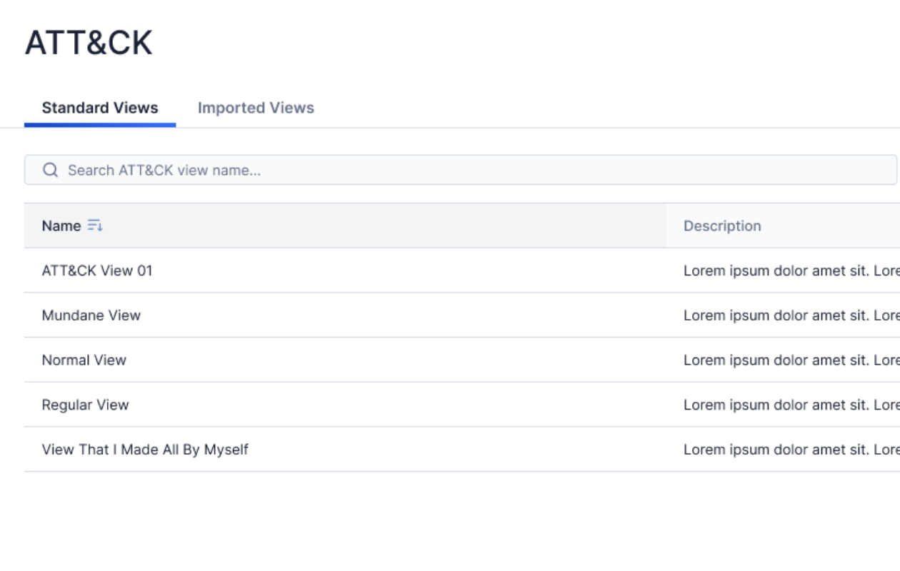
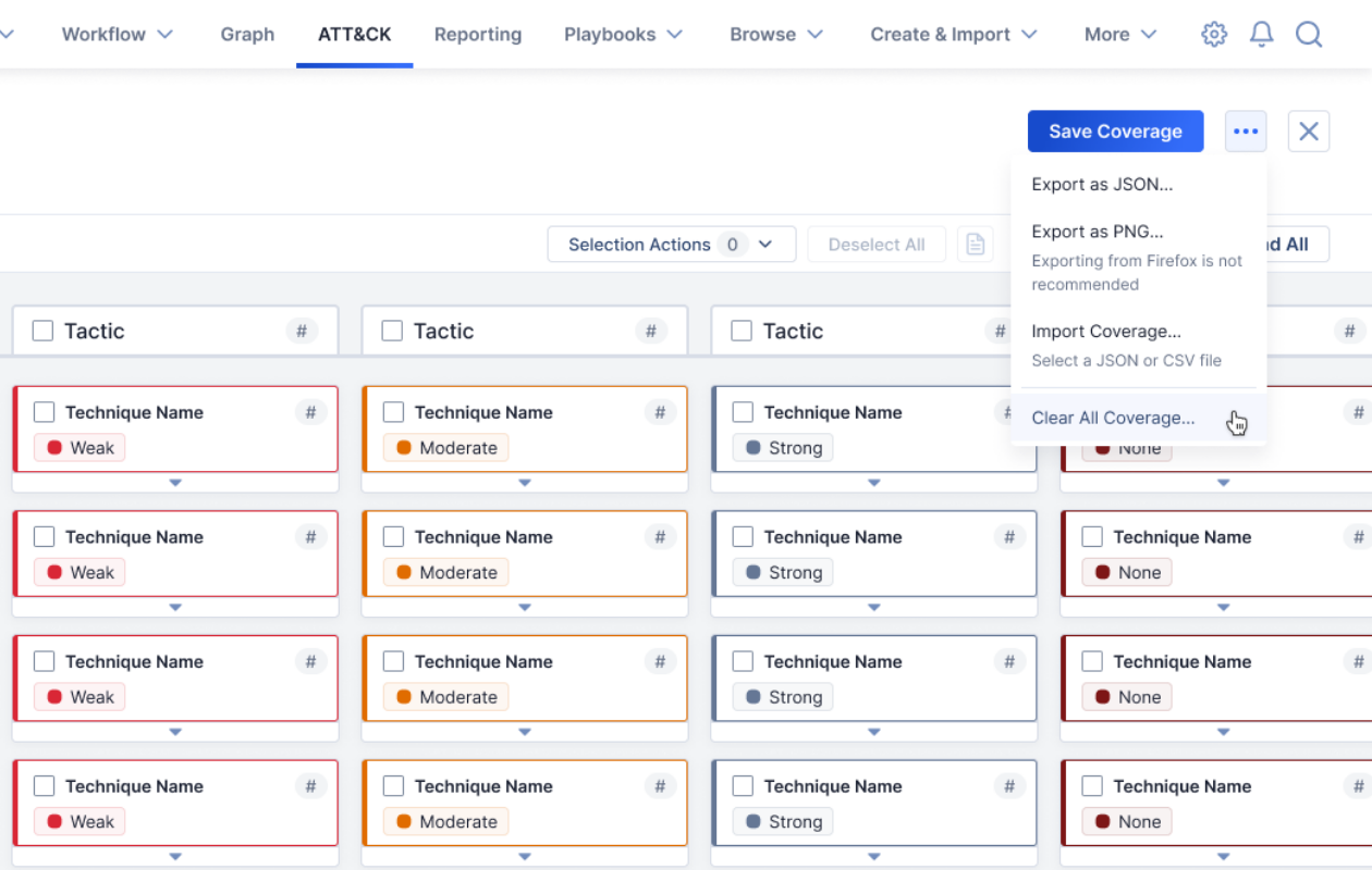
- Import existing MITRE ATT&CK views for reference in the app
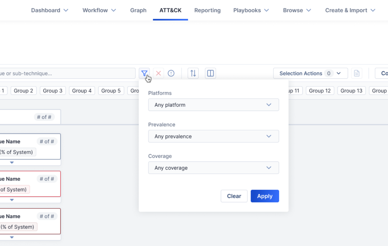
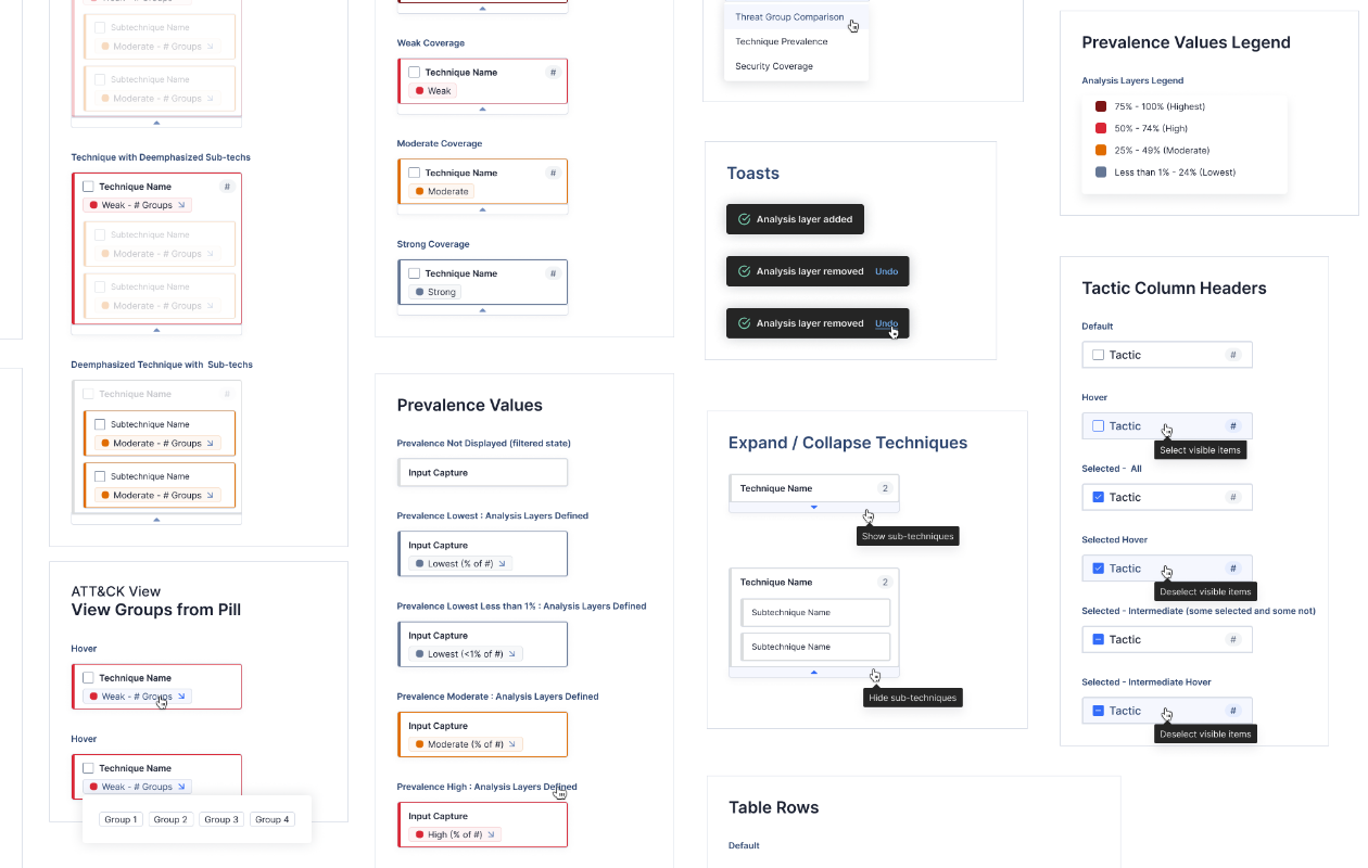
- Narrow techniques by prevalence and what technologies they target
My Involvement
- Role : Sole designer
- Timespan : 9 months
Scale : A new functionality in a browser-based cybersecurity application
Story
Well before this feature could begin development, our project manager had already received many requests from threat intelligence analysts for a way to utilize MITRE ATT&CK Navigator's many tactics, techniques, and sub-techniques in their day-to-day work. Competitors had already moved on the market's interest, but existing solutions were cumbersome, limited, or difficult to learn. Many had tried to solve the challenge of presenting the large library in a useful and digestible way, but none of our rivals had yet created a robust offering.
As such, this project began with reviewing our customers' requests and investigating tools that had touched upon the ATT&CK problem. The new view and its widgets would be distinctly different from anything existing in our application, so I needed to design something that would fulfill the users' needs while still fitting naturally into the system's established aesthetics and behaviors.
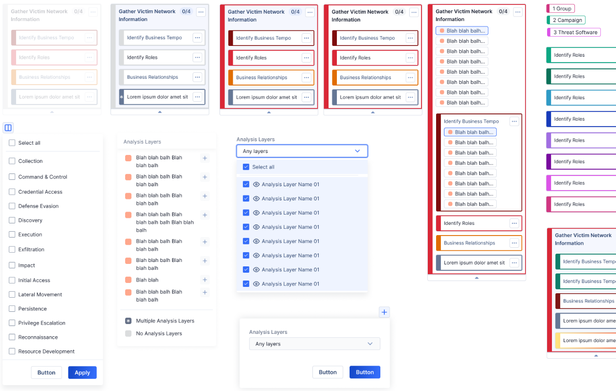
The new ATT&CK visualizer was to be developed in three releases alongside other functionality. Though the first round focused on a limited MVP (minimum valuable product) to ensure an immediate benefit, I was able to design the early interface to be scalable for all the other functionality I had seen in my research and knew was on the horizon. After a modest first release, we quickly followed up with many improvements in the second and third versions and had a well-rounded set of features in under a year. As adoption ramped up, customers praised the new ATT&CK screens and offered ideas for yet more functionality they wanted to see added.
One of the greatest challenges in this design was fine-tuning the interactions and visuals to make the navigator feel as approachable as possible. Looking at the screen can be overwhelming, given the glut of information available. Competitors had tried so many possible solutions that there weren't obvious best practices to follow, and we ultimately went in a unique direction that prioritized the users' needs and produced something that stood out as a shining example in the industry.
